Log in to your account
Lost password?Sales and Marketing
Your Last Ad : The Essential Guide to Developing Wine Labels
The essential guide to developing wine labels. Here are some of the basic tips for label design which helps the consumer when they are making their choice. Consumers around the world commonly have to make purchase decisions strictly on the information that’s physically on the bottle: primarily the front label and much, much more secondarily what’s on the back.
14/04/2017

Consumers around the world commonly have to make purchase decisions strictly on the information that’s physically on the bottle: primarily the front label and much, much more secondarily what’s on the back. With stores stocking 5,000 sku’s and more, there’s simply not enough room for case cards, shelf talkers and other POS to promote every wine.
That’s why it is absolutely critical for export wine producers to give significant attention to label design in terms of what information is provided.
I believe you can boil down all the market research, designer opinions and comments we’ve gotten from Importers, Distributors, Retailers and HoReCa/F&B managers down to two seminal questions consumer want answered:
- What is it?
- What does it taste like (in words that mean something to me)?
- Will it go with whatever I’m having for dinner tonight?
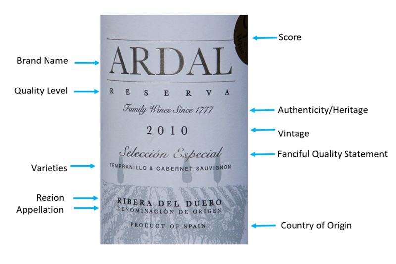
To answer the what is it question, make sure to communicate key pieces of information on the front label, include:
- Country of Origin
- Region/Appellation
- Color
- Varietal/blend
- Heritage/quality level
- Vintage
- A score or competition medal, if you have one
- A reference to taste (alcohol, sweetness/dryness level)
The second question speaks to a really important dichotomy in the language the trade speaks and the one consumers use. We, the trade, speak in terms of red fruits/dark fruits, or leather, tobacco, citrus and floral. And there are some who go beyond that basic vocabulary to use fanciful words that seem solely to reinforce the “hoity-toityness” of wine speak: Fried gooseberries anyone? Pickled walnut shells? Consumers on the other hand often use terms that need to be interpreted by the trade: dry/sweet, lemon vs. citrus, sour/acid, bitter/tannin et al.
And the third relates to the oft-reported maxim that something like 80% (don’t quote me on the number) of wine purchased at least in the U.S. will be consumed in 24 hours. “What’s the right wine to drink with the lasagna I’m making?”
So logic would dictate that the wise move is to simplify the message, use common language and relate on their level.
Here’s a very specific example. For a Ribera del Duero wine, lose the geek-speak and communicate to consumers in words with relevance: “Made for tapas, try it with tacos.” Seven words that give you both sufficient information and reference point and direction.
The bottom line is that while advertising, PR, shelf talkers, case cards, critics reviews etc. help, at the end of the day the only thing you can be sure your consumer can know about your brand is the information you put on the bottle.
Consumers around the world commonly have to make purchase decisions strictly on the information that’s physically on the bottle: primarily the front label and much, much more secondarily what’s on the back. With stores stocking 5,000 sku’s and more, there’s simply not enough room for case cards, shelf talkers and other POS to promote every wine.
That’s why it is absolutely critical for export wine producers to give significant attention to label design in terms of what information is provided.


